Sail · 2019–2020
Helping men train their mental fitness
Co-Founder & Head of Design
Overview
Sail helps men connect with mental health professionals. As company co-founder and head of design, I owned the entire product and brand — from research through launch — working alongside a co-founder/product manager.
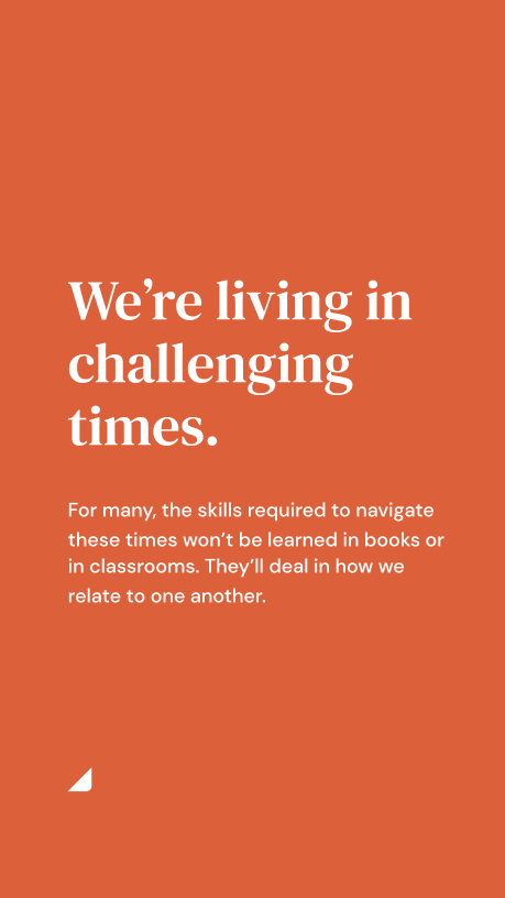
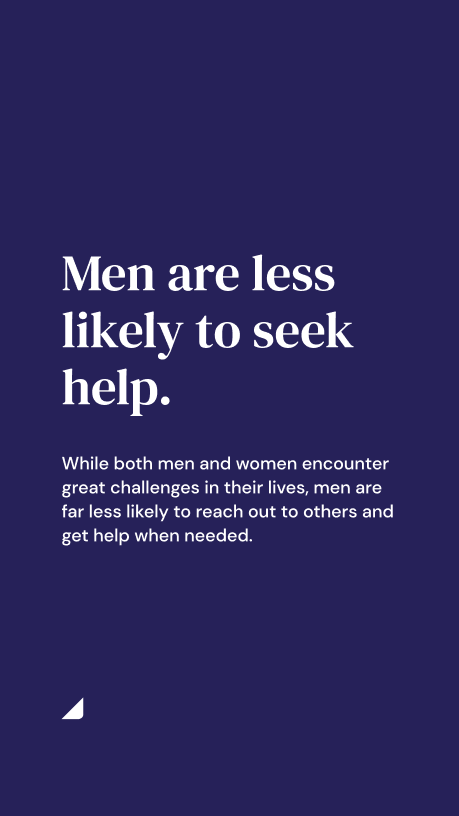
Our hypothesis was that men are disproportionately less likely to seek help for themselves, yet disproportionately responsible for so many parts of society — and society’s problems. If we could help men take better care of their mental health, we believed we could help society at large.
Part of the challenge wasn’t just building the product — it was taking on the stigma of men needing to seek out professional help in the first place. Everything from the brand voice to the visual identity had to thread the needle of feeling approachable without being patronizing, and masculine without reinforcing the very attitudes that kept men from getting help.
Branding
The branding challenge was fundamentally the same one our mission was trying to take on: de-stigmatizing mental health for men. We didn’t want to create something that felt too masculine or too feminine. The challenge was to land on something relatable and modern that didn’t lean into clichéd visual tropes about masculinity — brushed metal, aggressive fonts, dark brooding palettes — while still resonating with the men we were trying to reach.
I explored many directions, starting with a color analysis of existing competitors to position our brand. We initially targeted the therapy space, but discovered it was both visually crowded and competitively difficult to break into.
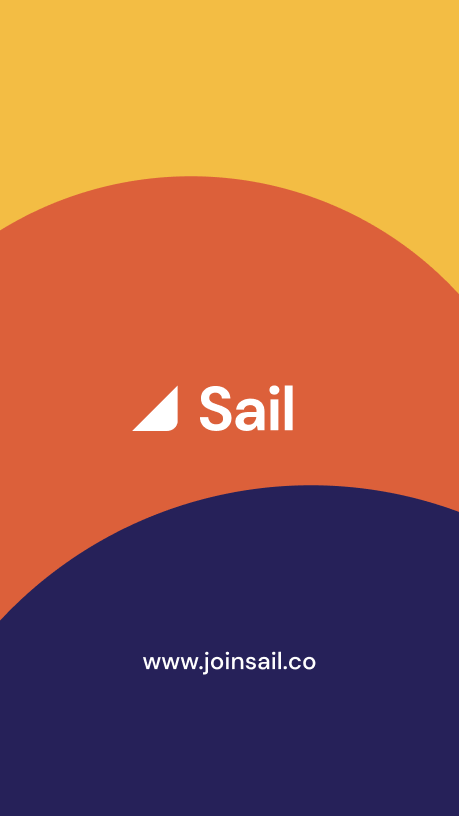
Ultimately I landed on a tricolor palette to capture the optimism, trust, and courage we were going for. The warm, approachable identity felt like a reflection of the product’s purpose: inviting men into a space they’d traditionally been told wasn’t for them.
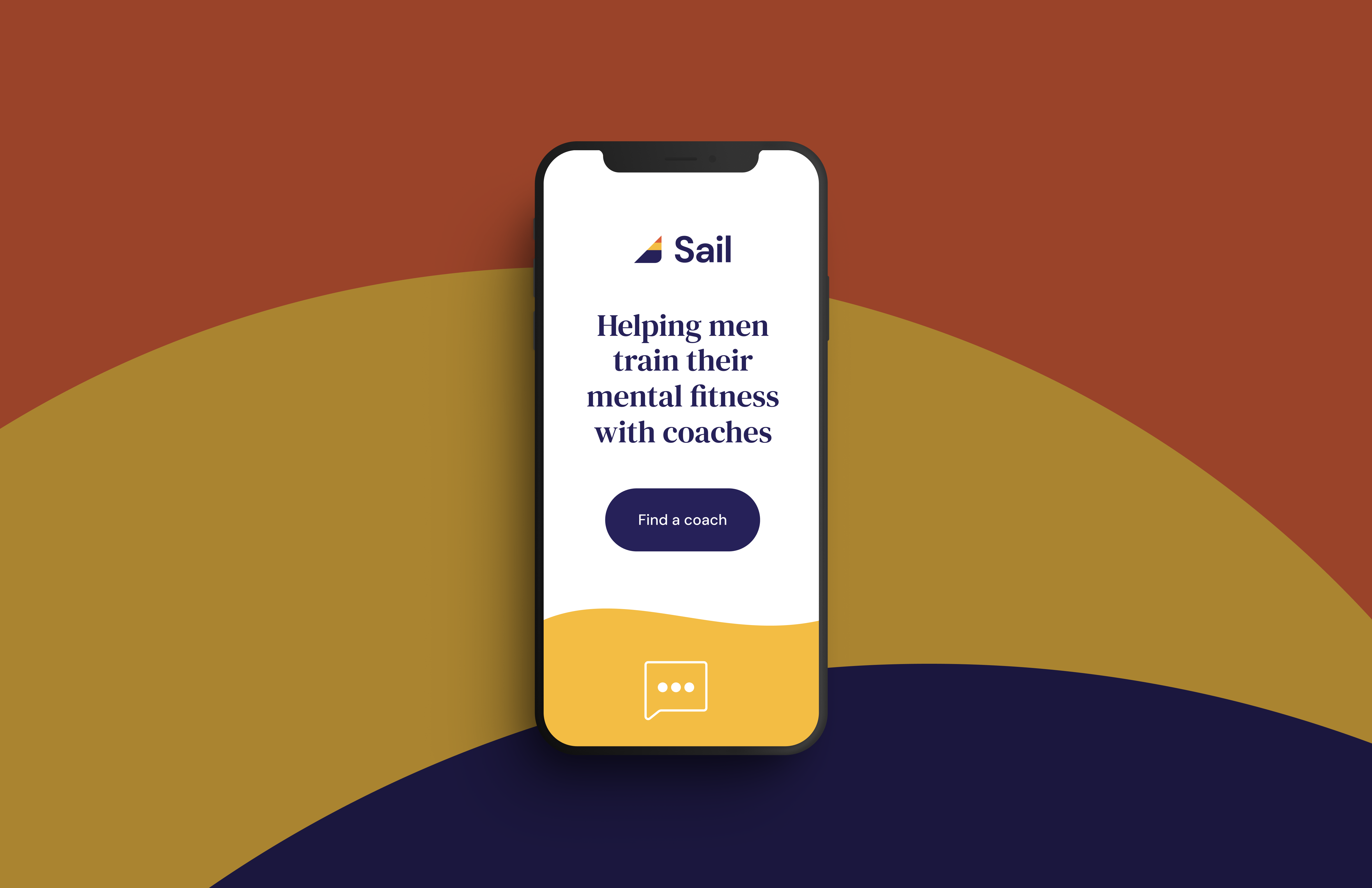
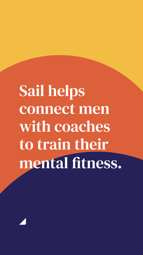
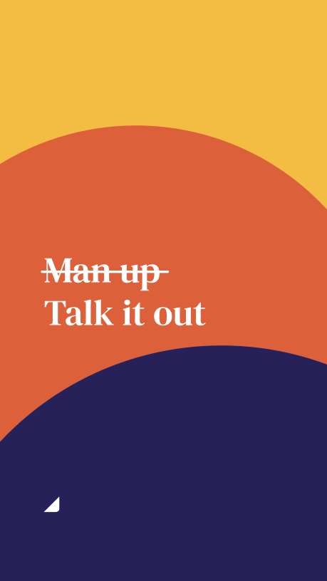
Social Marketing
The brand relied heavily on social media for growth, so extending the brand to work well for social posts and stories was a key challenge. The colors translated well to be used on their own and together for larger moments.
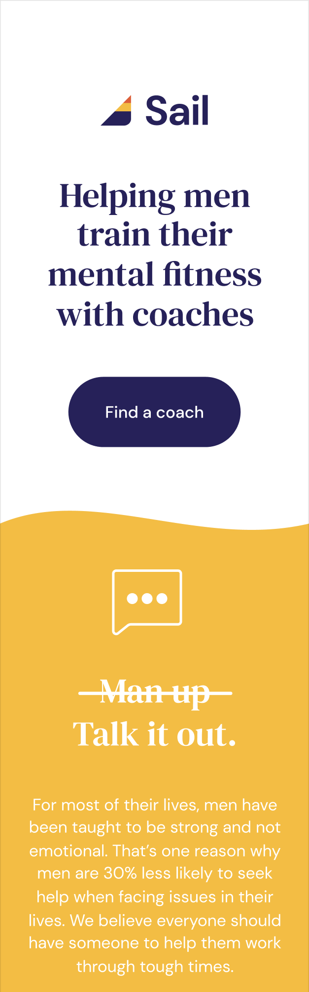
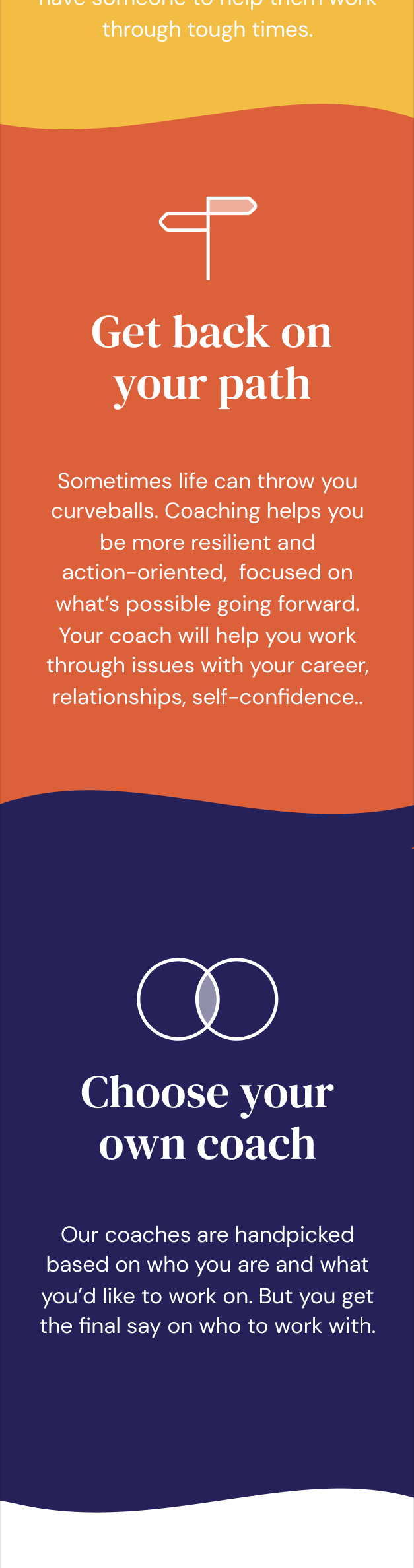
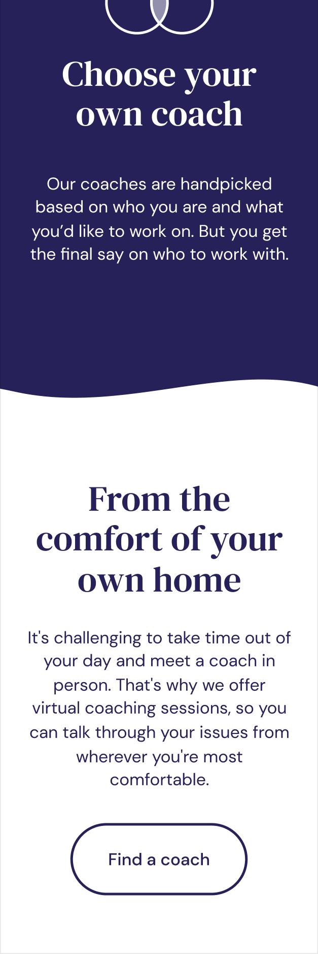
Web
The web landing page brought together all the design elements: copy, voice, type, color, illustration, and UI. I built the site on Squarespace for ease of use and speed, which drove to our onboarding funnel. We optimized the page over time with the brand messaging that saw the highest CTR on our social feed.